
Creating a Ranking System for Pittsburgh Tech Meetups
Using data collected from meetup.com to discover which user groups are at the heart of Pittsburgh's tech scene
Pittsburgh, PA: A Place for Tech
After using my python script to generate a dataset on every registered meetup group in Pittsburgh, the first question I asked myself was: what is the most popular meetup category? The data quite clearly indicate…
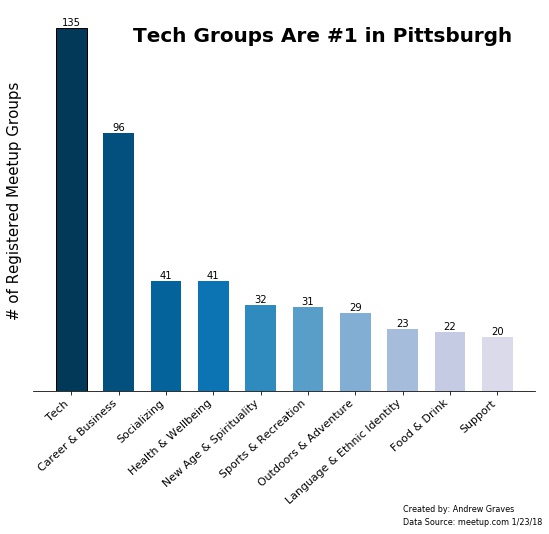
“Wow, Pittsburghers love their tech meetups!”, I thought.
“But wouldn’t it be nice to know which of these 135 groups are the real ‘pillars’ of the meetup scene?”
So my question then became: How can we use the data to rank the groups by order of prominence?
Let’s see…
Starting with Membership Base
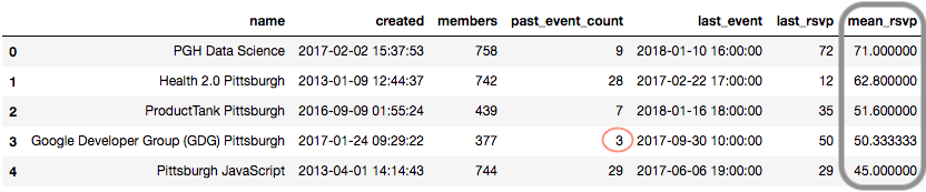
The most obvious place to begin is to see which groups have the most people:
![]()
Not bad! It looks like the largest groups range between roughly 1,500 to 3,500 members each.
However, looking over at the rsvp column, notice how large membership counts do not equal large event turnouts.
RSVP Count Matters Too
The most popular groups in the community should also have well-attended events, right? Then we should definitely include RSVP counts in our ranking system.
But wait! Instead of using the counts from a single event, let’s make this metric a little more reliable by looking at the last five hosted events for each group and find the mean RSVP.
Five events should be robust enough to be representative, yet at the same time, small enough to keep the info as current as possible. If a group has less than 5 total events, we will take the mean of however many they have.
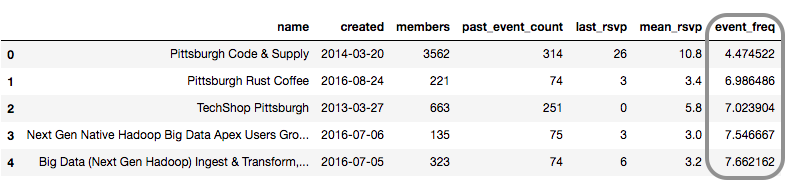
Once we gather the necessary data from the meetup.com API and sort our groups accordingly, we get this:
Hmm…one of the top groups by RSVP has only had 3 events in the past year! I think any group we label as being “at the heart” of the tech scene should be a little more active, don’t you? So…
How Do We Measure Activity?
This question is trickier than it first appears.
We have a column for past event counts that might initially seem like a straightforward solution. However, using this as a comparison would give more weight to older (but not necessarily more active) groups - think about a hypothetical group with 25 events spread over 100 years versus a new group with 10 events within its first 2 months!
We might also try ordering the groups by whoever had the most recent event, but this will not tell us how often events actually take place.
I think a good solution is to calculate the average wait time between hosted events. We can do this by taking the age of the group divided by the number of past events.
We now have a column event_freq with the average wait time measured in days. This is a much fairer way to compare old and new groups alike.
Pulling it All Together:
We have decided on 3 dimensions for our ranking system:
- Size of Membership Base
- Mean RSVP Count
- Event Frequency
Since we are ranking our groups, calculating percentile scores for each dimension seems appropriate.
For example, a membership score of 90 means this group has more members than 90 percent of all other groups.
All that’s left to do now is calculate the mean percentile score for each group across all dimensions and declare our winners.
So…
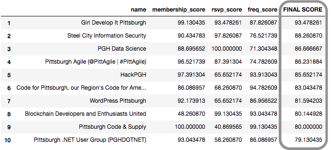
Our Top 10 Most Prominent Tech Meetup Groups in Pittsburgh:
![]()
UPDATED 1/27/2018: The original analysis from 1/23/2018 used the most recent RSVP count instead of a calculated mean. If you want to see those original results, click here. Special thanks to Jon for his suggestion (even though it did bump his group off the top 10!)
If you’d like to see how I did the analysis in more detail, check out the jupyter notebook for this project.